


Symptrack
Search and track your symptoms with authoritative answers. Symptrack is a mobile app powered by Patient First, a government-led initiative aimed at improving healthcare for patients. Symptrack provides a quick and efficient way for users to know about their symptoms with authoritative information whenever or wherever they want, to help them make informed decisions online about their health.
* Project Type Unit Project
* Duration Oct. 2021
* My Role UX/ UI Designer
* Platform IOS
* Tools Figma, Invision
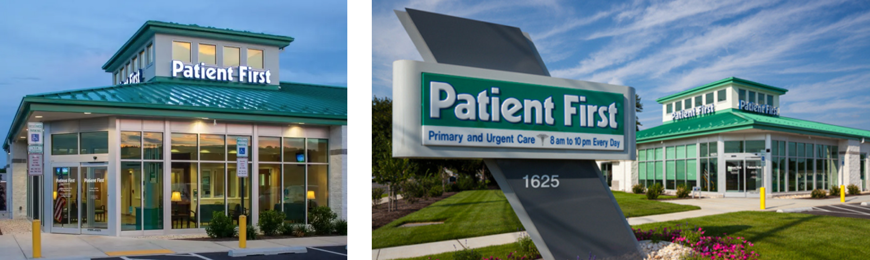
Patient
First
Who is Patient First and what do they do?
Patients First is a government led initiative aimed at improving healthcare for patients. The initiative aims to place people and patients at the center of healthcare by more deeply understanding patient needs and experiences, while improving patient outcomes. Patients First focuses on improving access to fast and reliable healthcare, connecting patients to all available healthcare services, and supporting patients by providing them with the education, and knowledge they need to make decisions about their health.
In this project, my first task is to conduct research that builds an understanding of patient experiences more generally, while attempting to understand how people manage their health through existing healthcare services and sources of information.
What is
the problem?
The primary aim of the research was to understand patients’ experiences, in order to gain helpful insights to develop human-centered healthcare services for Patient First.
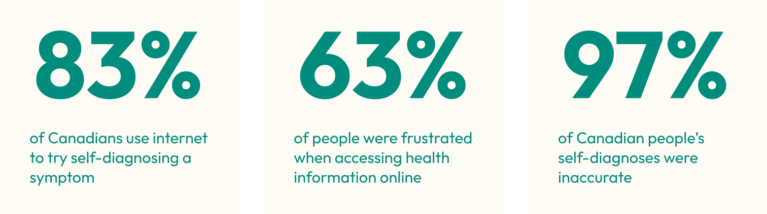
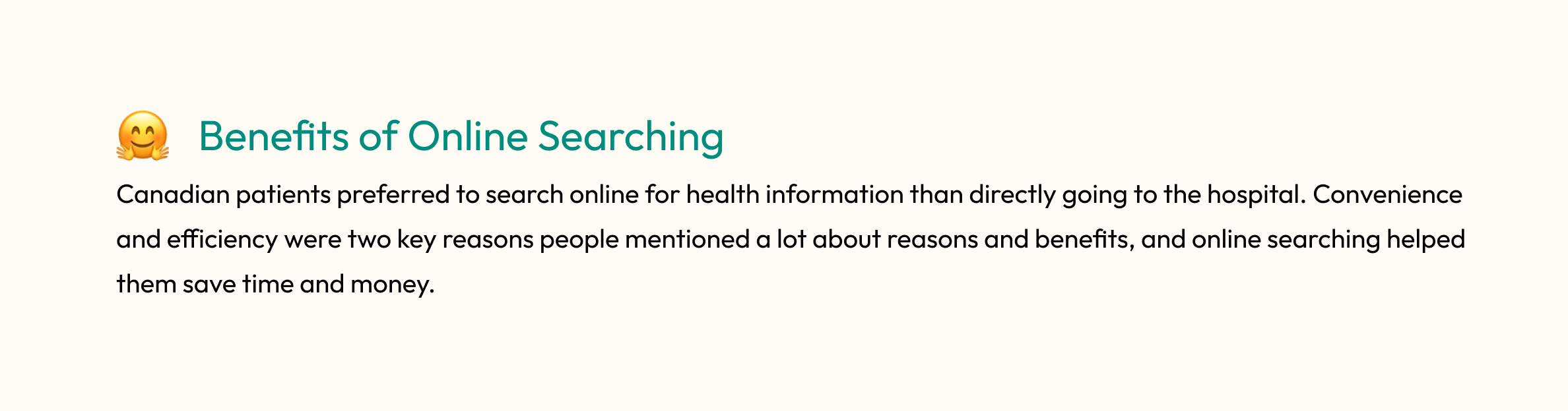
More than half of people like to search online for symptoms, it is reported that online health searching is the first source people will choose rather than doctors. It is genuinely a more convenient and quicker way for people who don’t like to go to the hospital, don’t want to pay too much, don’t have health insurance, don’t have a family doctor, or have time constraints.
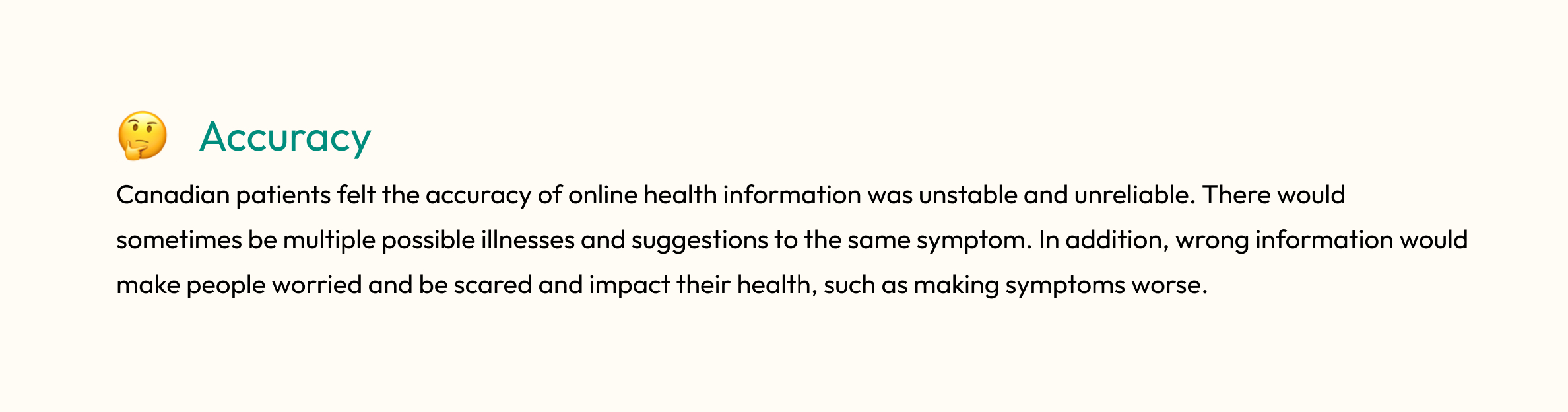
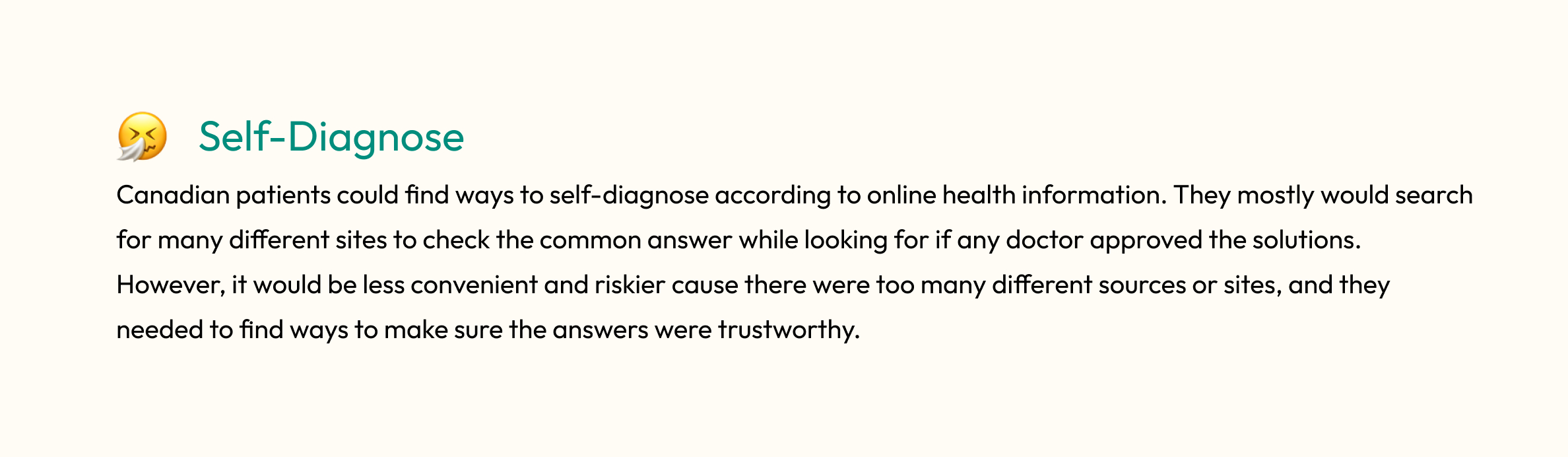
However, there will be multiple different answers to the same symptom. In addition, the truth is 74% of the online symptoms checks failed to produce the correct diagnosis, which means they are not trustworthy. The wrong information can make people eat inappropriate medications by overestimating their symptoms and making conditions worse by underestimating their symptoms. They can also make people overwhelmed and anxious.
Secondary
Research
The data helped me understand how patients manage their health through online platforms and how they were doing.
Interview
Insights
I conducted a few interviews to better understanding target groups' experience of preparing and keeping a pets.
So...here comes a question...
How might we help Canadian patients make informed decisions online about ttheir health in order to prevent miss diagnose seen themselves?
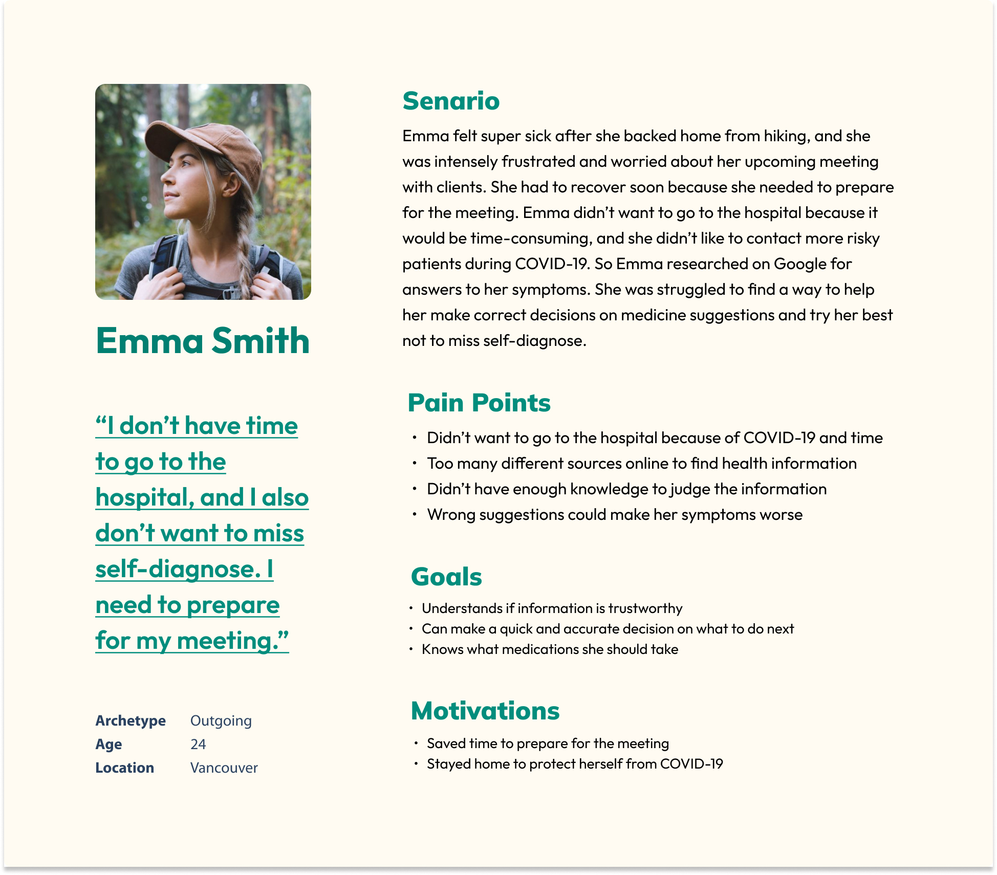
Persona
Task Flow
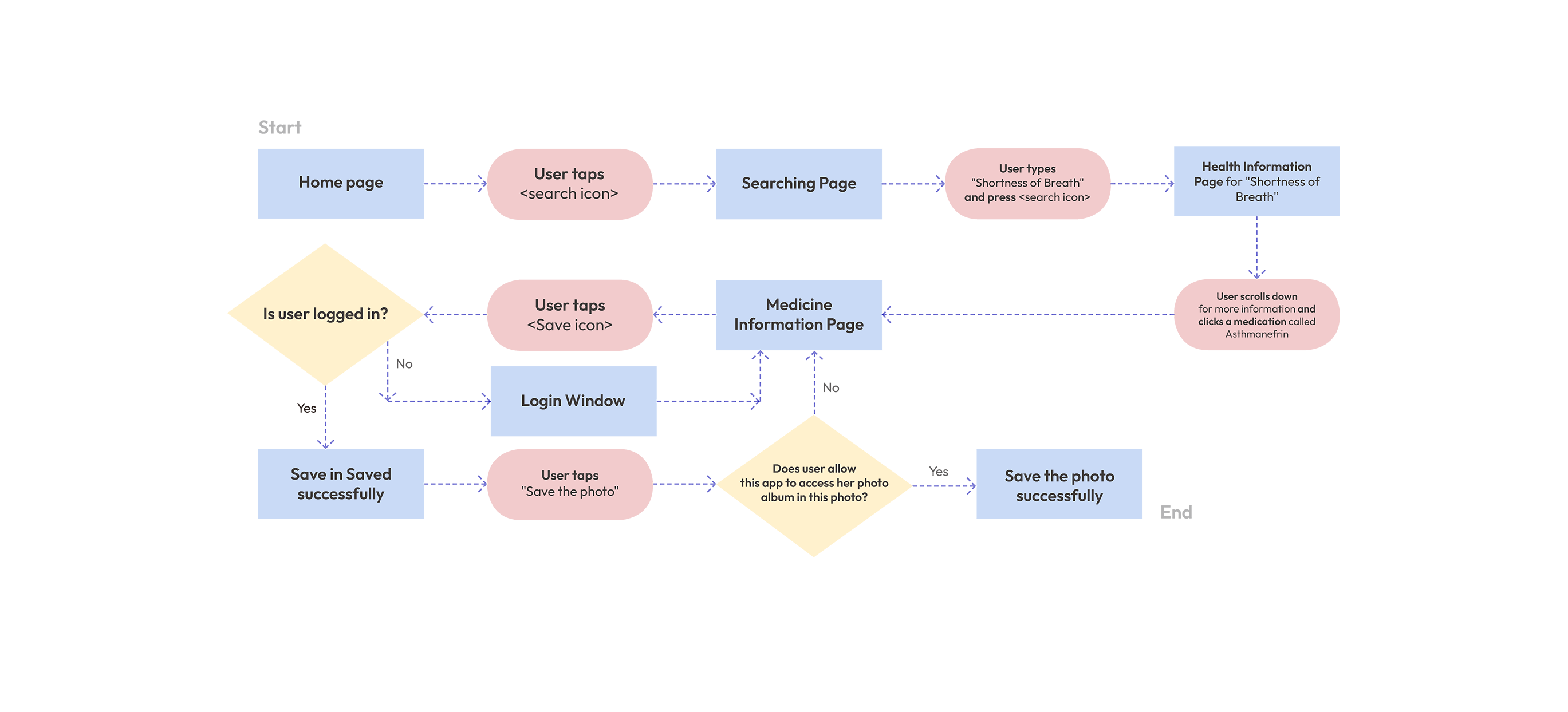
This task flow in the app is created based on the primary and secondary user stories.
Primary Task As a patient, I want to get quick information online about what’s happening to me so that I don’t need to spend time going to the hospital.
Secondary Task As a patient, I want to see if the medicines have any terrible side effects so that I can reschedule my important meeting with clients in advance.
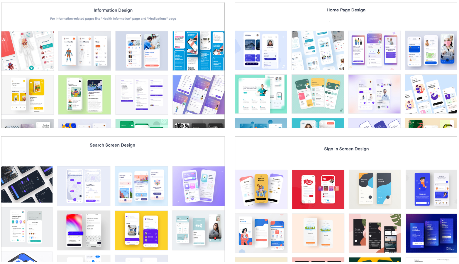
UI Inspiration
Board
I found some user interface inspirations from competitors' apps and other relevant apps, to understand why they are doing great and organize my ideas.
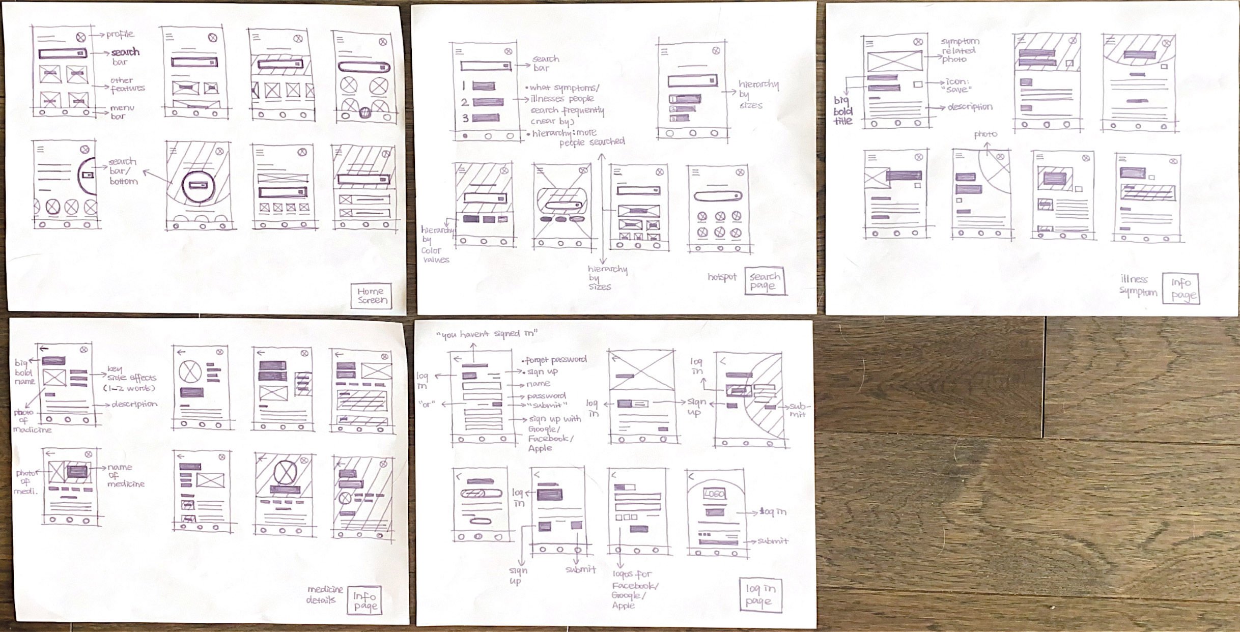
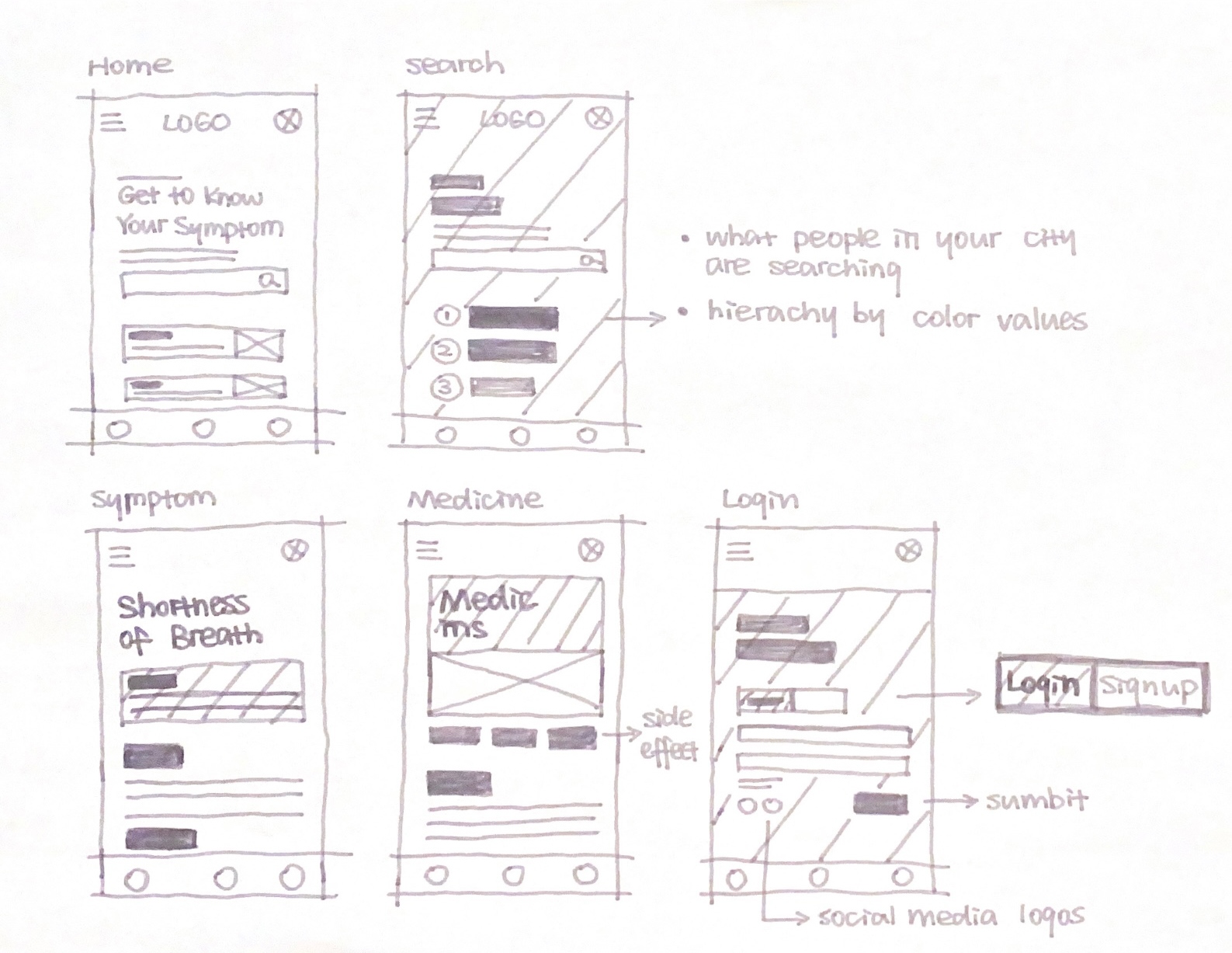
Sketches
According to the UI inspirations boards, I have made sketches on paper to brainstorm multiple layout ideas for each main feature/ page. The last one was the solution sketch that I decided to go with.
UI Design Decision
For the primary color in the app, I decided to use the same green color that Patient First used as their branding color. I also used light blue as the secondary color to represent a trustworthy and calming atmosphere. A pale yellow was used for the background to protect users' eyes with less contrast with the contents.
In addition, I didn't use very sharp lines or edges because I didn't want the app to be super intense. The users would probably be worried while searching for their symptoms, it would be unnecessary to increase their feelings of tension, so I decided to make it approachable. I aimed to make users feel peaceful, calm, and not anxious through the app while maintaining the information's authority. .
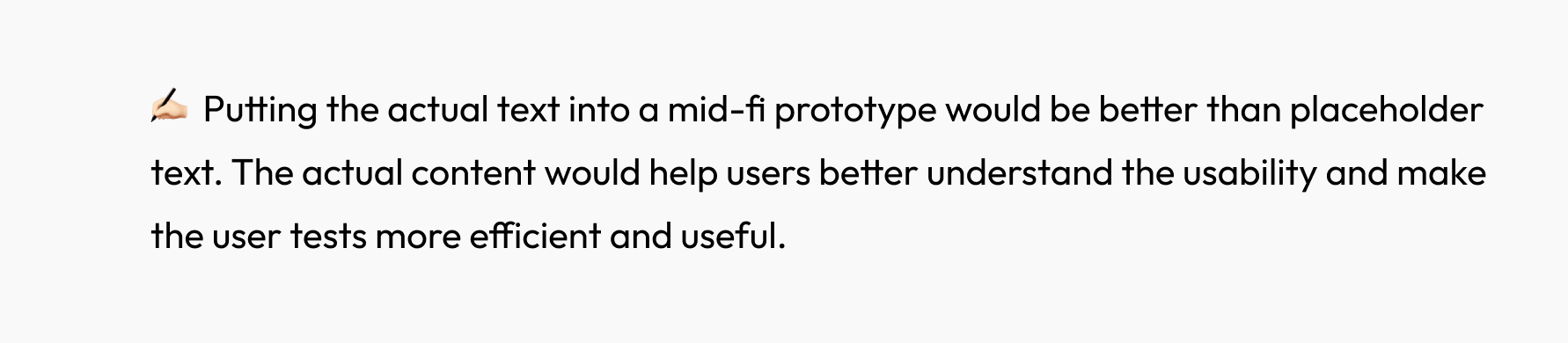
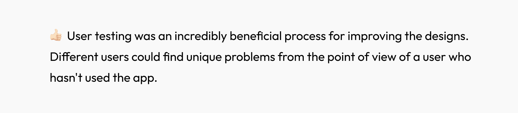
Mid-fi Prototype
Iterations Highlights
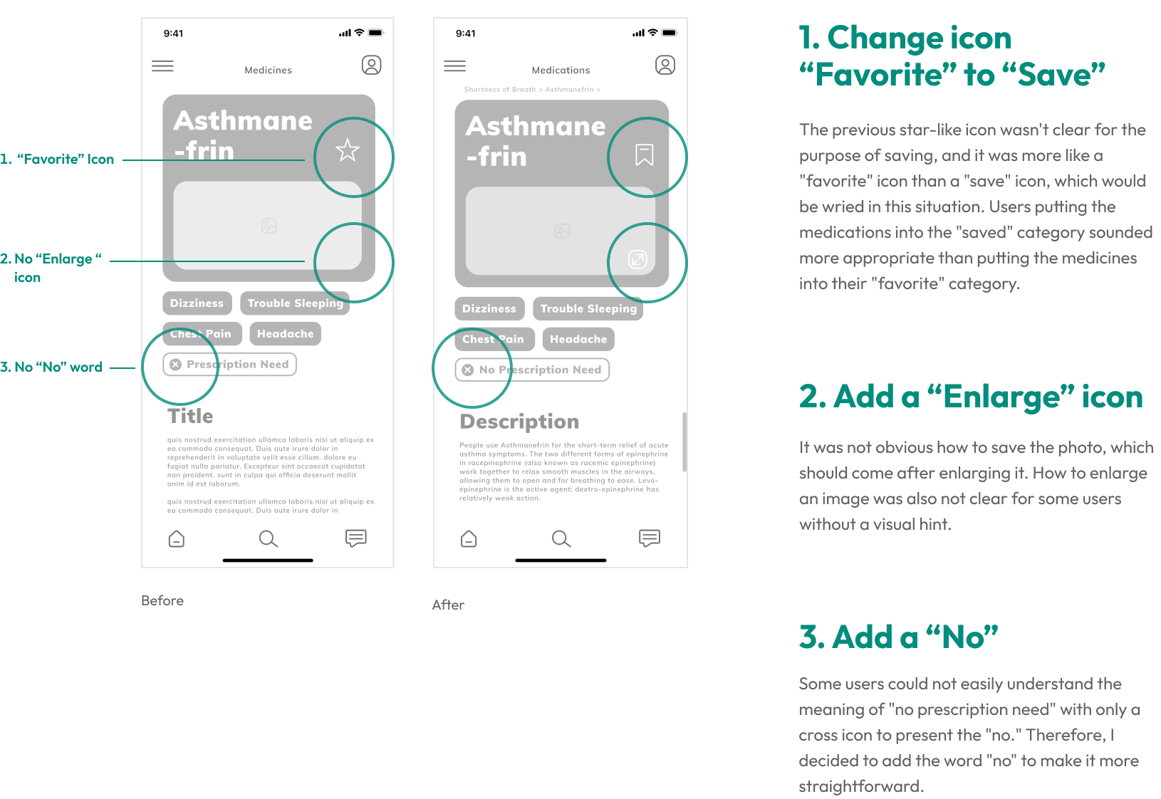
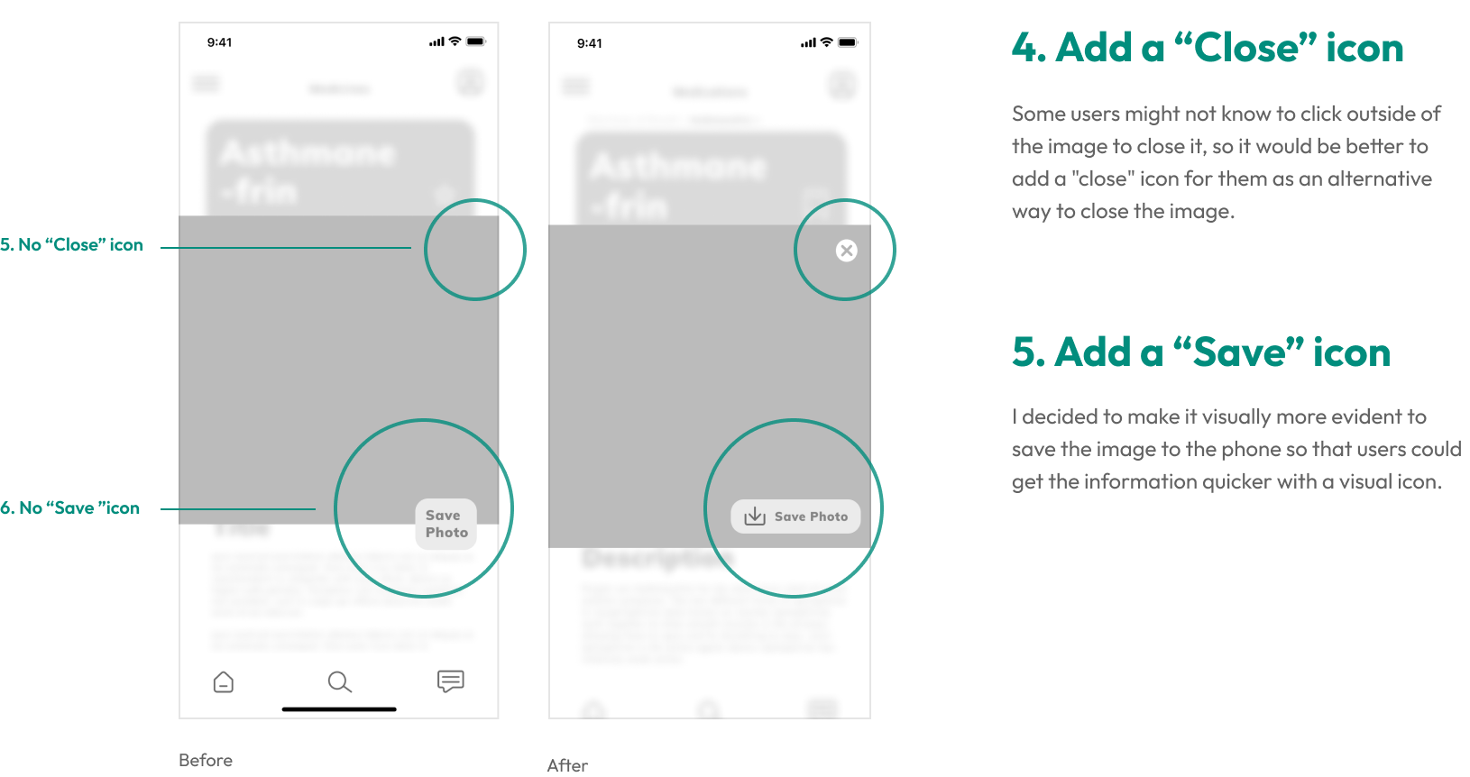
Mid-fi prototypes were made to help me focus on useability which is the primary key point in UX/UI design. Therefore, based on one round of user testings, here you can find a few prominent examples of adjustments.
Features in
The App
Based on the primary and secondary user tasks, those were main highlights of features were added to solve the problem conveniently.
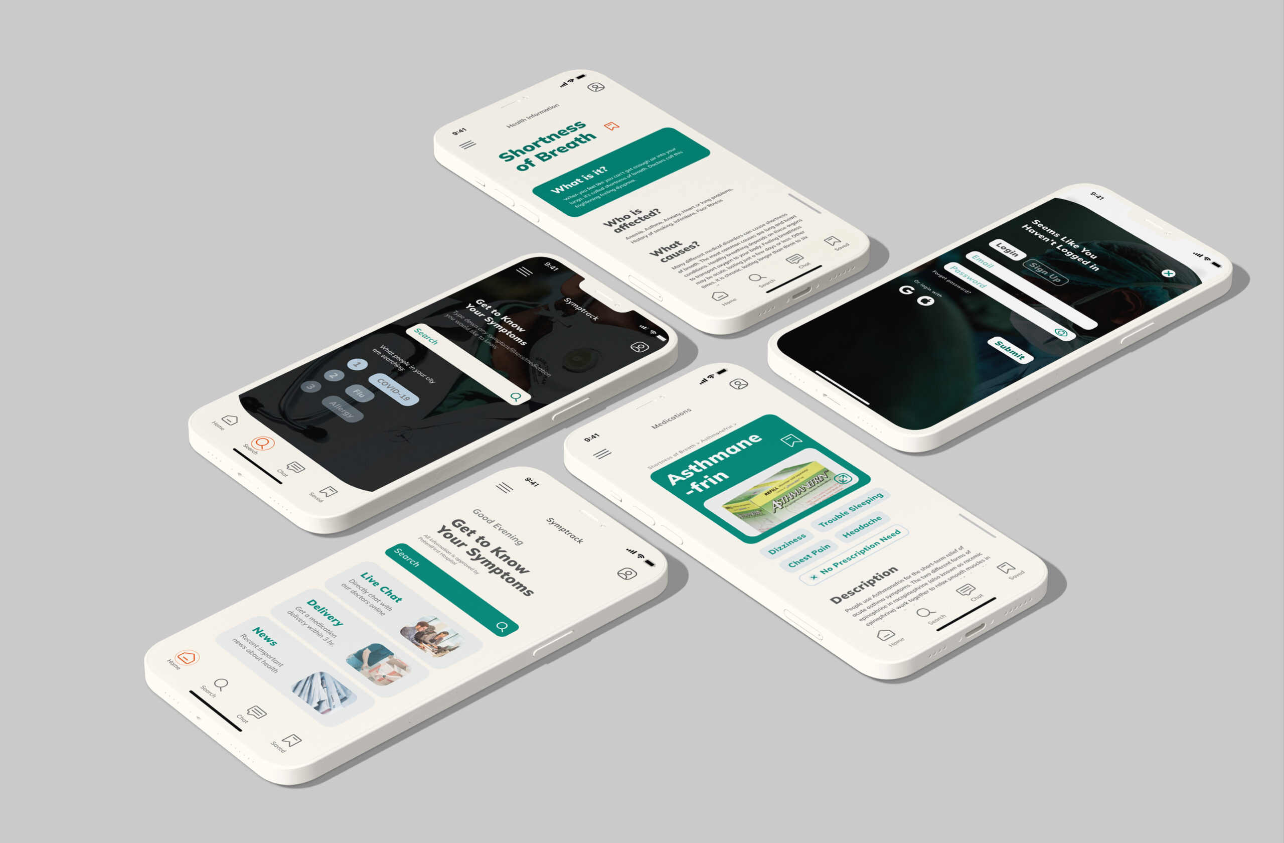
Searching and getting to know your symptoms. Users can easily and quickly search for their symptoms in the app. In addition, they can also know what people in their city are searching for. It can be quicker access to the contents, or understanding what's going on around them, and then users can take preventive measures in advance to protect themselves from these illnesses.
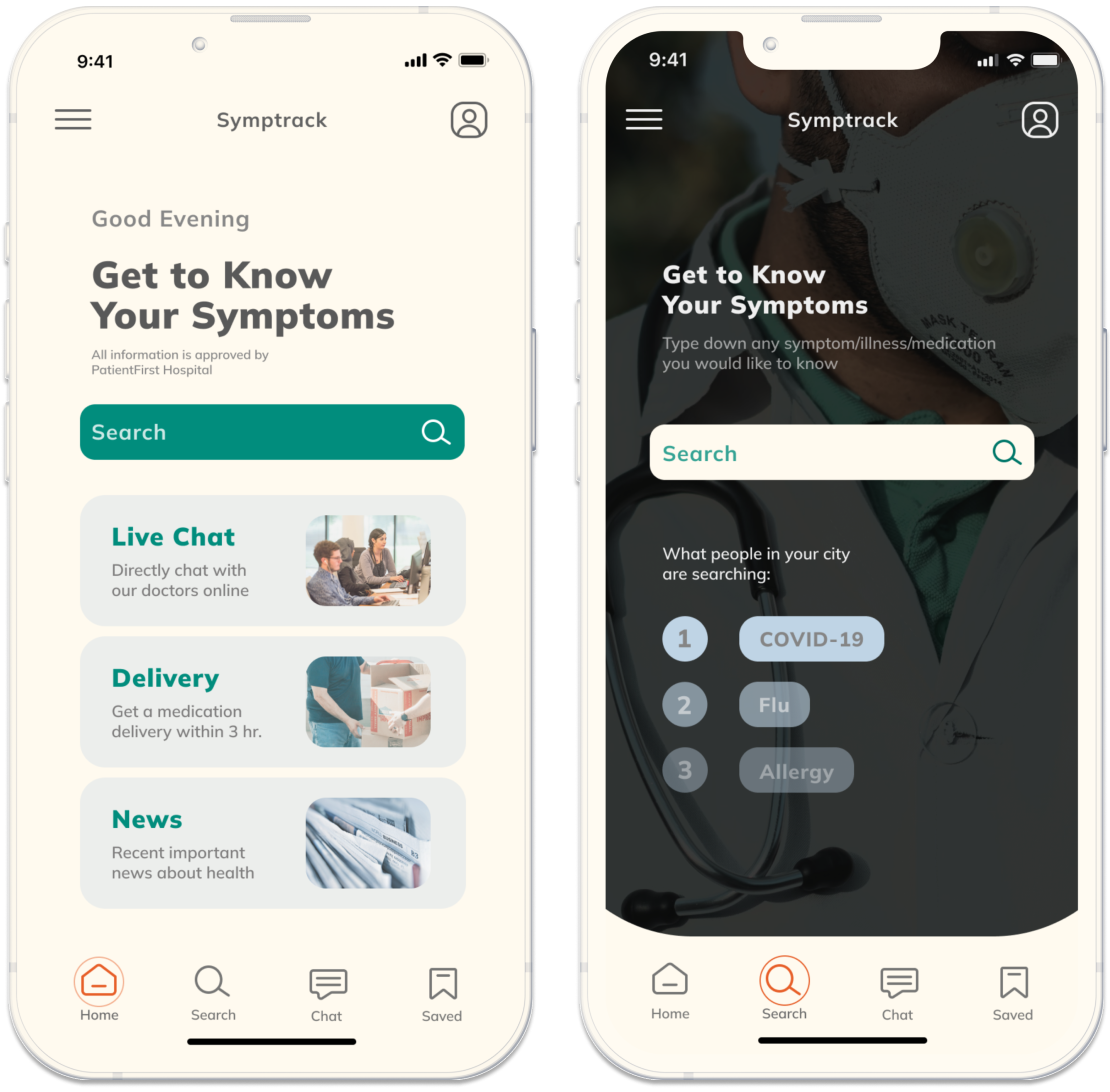
Understanding more about the symptoms and suggested medications. Users can understand their symptoms better with details, like why it happened, what they should do or should not do, or when to contact doctors. They can also know more about the medications they are suggested to take with side effects, dosages, and warnings.
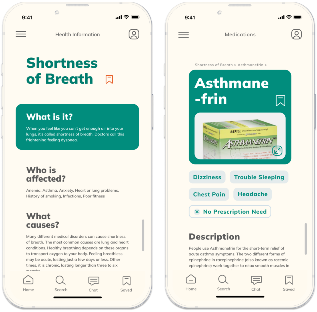
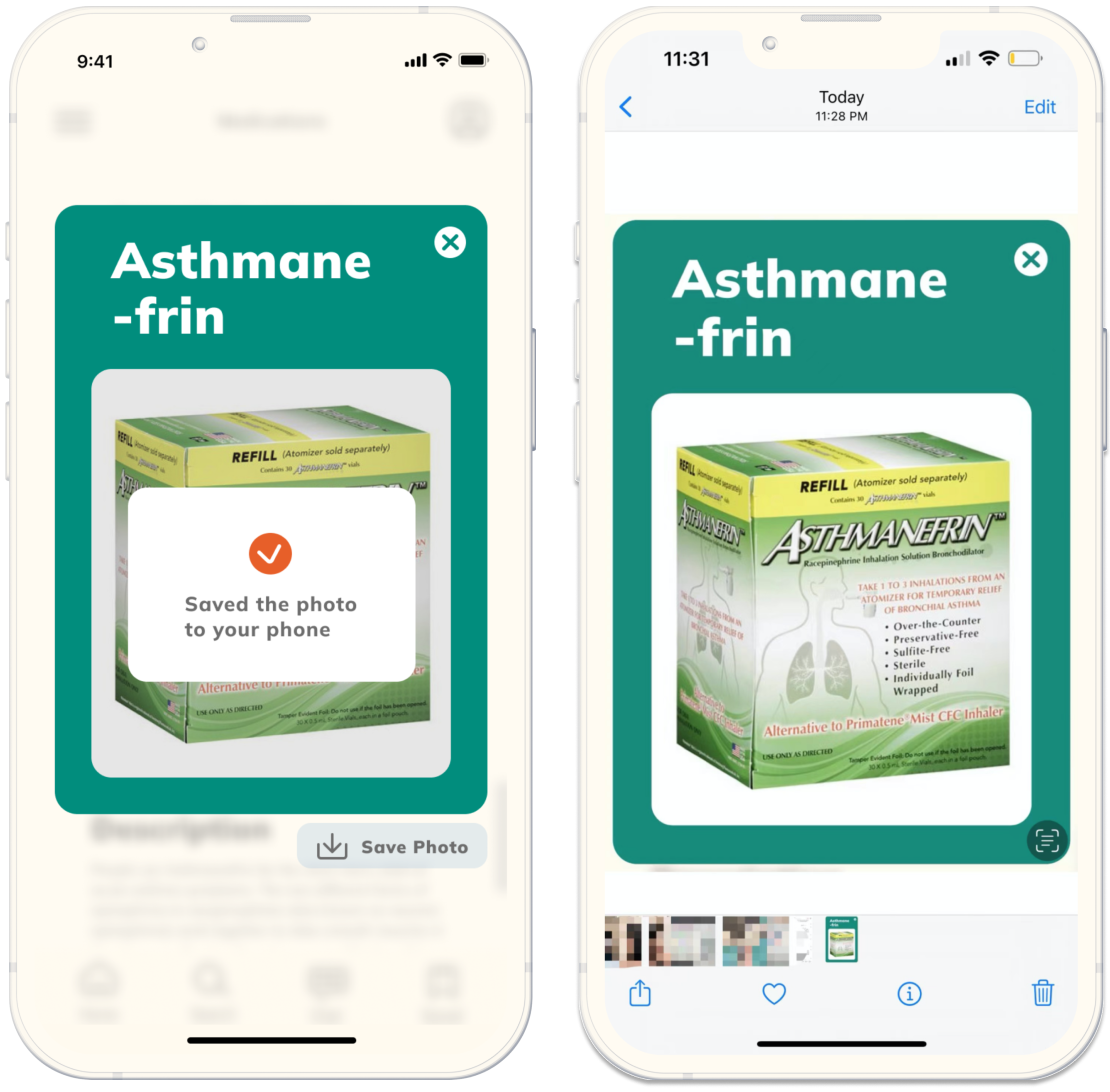
Making it easier to buy medications at pharmacies. Remembering the name of the medicines is hard. Therefore, they can easily save the photo to their phones and directly show it from their photo albums to the pharmacies.
Final
Prototype
After adjustments from user testings, I have developed my hi-fi prototype for Symptrack.
Design Impact
Smptrack provides a quick and efficient way for users to know about their symptoms with authoritative information whenever or wherever they want.
Users don't need to go to the hospital if they don't like to or don't have time to do that. It helps them save some time from searching around the entire internet world, and it also helps them make informed decisions to self-diagnose themselves or if they have to see doctors. Their life will be easier with fewer worries about their health.
Key
Learnings
I learned a lot through this project's whole UX process. Every step meant a lot to me.
Good things happen when you connect
© 2022 Gabby (Lieyijia) Du
